Order-to-Deliver Reporting
Order-to-deliver reporting is your most important customer fulfillment metric.
About the order-to-deliver metric
Use Shipium's Order to Deliver Reports to understand the experience that your customers are seeing both in absolute terms and relative to your service-level agreement (SLA).
Two reports provide top-line understanding of order-to-deliver metrics: Order to Deliver Performance and Order to Deliver Percentiles. Each report offers insights into how your customers experience their deliveries but with different focuses.
Order-to-deliver performance report
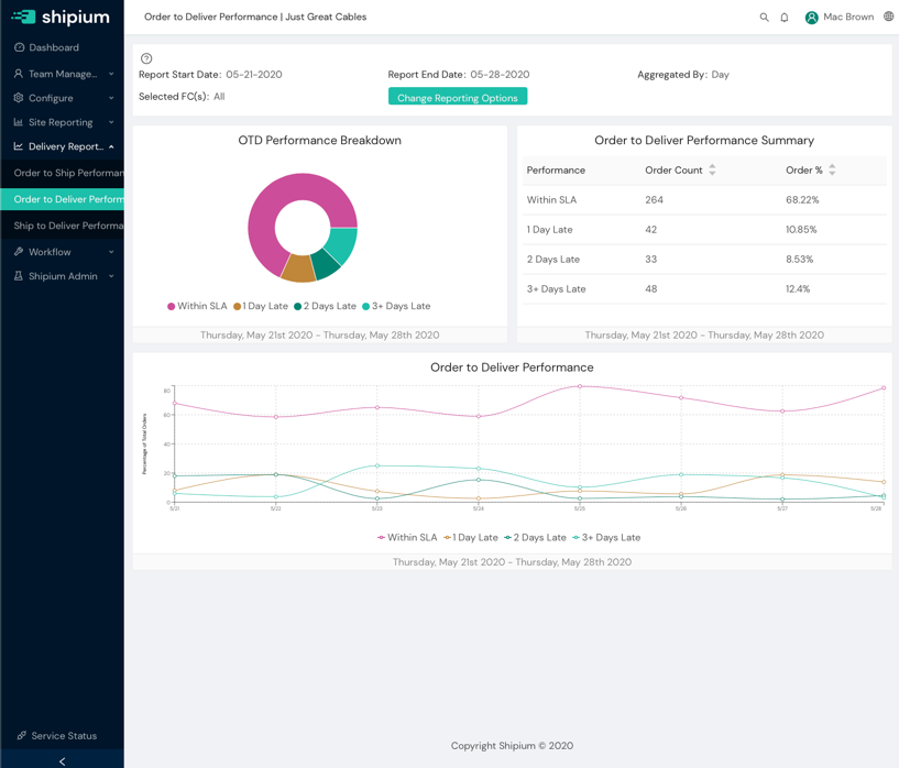
The Order to Deliver Performance Report provides a detailed look into the performance that your customers are seeing relative to an SLA that you configure, from the time that they place their order until the time that it is delivered to their home or business. There are three major components on this page, each of which gives you a slightly different look into your order-to-deliver performance.

Order-to-deliver performance breakdown
This wheel chart panel will give you a quick visual overview of how your organization's order-to-deliver times are distributed relative to your SLA. Everything at or below the SLA will appear in the bucket "Within SLA" and beyond that, you will see buckets by days of missed SLA. This chart is intended to help you understand how your organization is performing against the expectations that you have set.
Order-to-deliver performance summary
This tabular report panel provides a breakdown of how your organization is performing against SLA. This is meant to give you a more specific breakdown of the same data that you see in the Order to Deliver Performance Breakdown wheel chart and includes both the specific percentages for each bucket as well as order counts.
Order-to-deliver performance over time
This line graph panel gives you one more take on the same order-to-deliver performance information that you see in the other charts, by providing the same data graphed over time. This can help you better understand how your organization has performed over time.
Order-to-deliver percentiles report
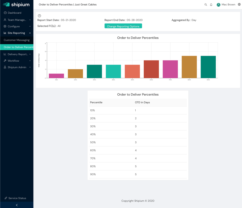
The Order to Deliver Percentiles Report takes you from understanding how you are performing versus an SLA into the details of exactly what percentage of your customers are seeing what kind of performance over the time period in question. The data and the presentation are not complicated, but this is one of the best tools for understanding how you are performing for your customers from the best-case performance to the worst-case performance.

Understanding percentiles
A percentile represents the value at which some percentage a given data set falls. For instance, the 20th percentile represents the value that the best 20% of a population sees. In other words, 20 percent of the population sees a value at or below this value. We use percentiles because they help you understand the performance across your entire customer population in a way that single-point statistics like the average just can't do.
The reports
Each of the report panels will show you the performance that customers are seeing for order-to-deliver over the time period and other filters that you have set in the Reporting Configuration at the top of the page.
Order-to-deliver percentiles columnar chart
This columnar panel gives you a quick graphical representation of the order-to-deliver times at each 10th percentile mark. This gives you a quick way to see both what your customers are experiencing for order-to-deliver and understand how the best performance and worst performance look for your customers as well.
Order-to-deliver percentiles table
This tabular report gives you the same information, but in tabular form. Its uses are the same, but this makes it easier to look at the numbers once you have viewed and understood the overall pattern. It is also easier to pull into other reporting software (e.g., Excel) if you need to do your own custom reporting.
Resources
Your Shipium team member is available to help along the way. However, you might find these resources helpful:
Updated 5 months ago
