Reporting Content
View data in multiple formats.
About reporting content
On any given reporting page, you will find one or more Reporting Panels, each of which provides a different graphical or text-based representation of one or more pieces of data. In general, you will set the Reporting Configuration to be specific to the data set in which you are interested and then you will see the reporting panels on the reporting page update to show you the data in question.
This document outlines the major types of Reporting Panels that you will find across different Shipium reporting applications.
Tabular report panel
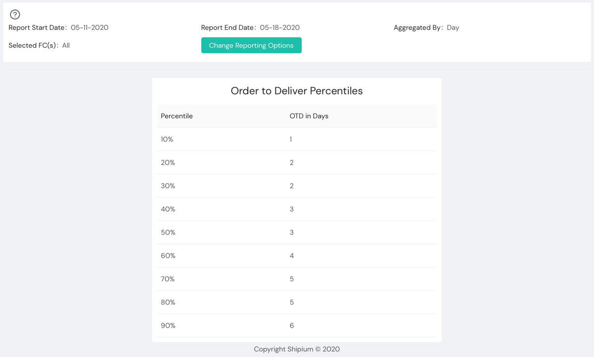
One of the most common report panels that you will see across different Shipium report pages is the tabular report panel.

Tabular report panels show a table of data, generally numeric data such as percentiles, medians, and values for particular dates or other similar pieces of numerical data.
In most cases, you will be provided with a way to download tabular data as a CSV file that is appropriate for Google Sheets, Excel, or other spreadsheet applications.
Columnar chart report panel
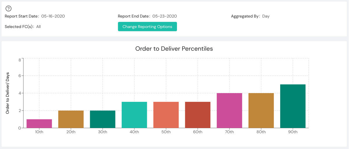
Columnar charts, often called bar charts, are useful for showing numerical data over some kind of series.

You will frequently see columnar data with one column representing a time period, percentile or other metric. Within the Shipium platform, this view of data is used when understanding the progression of data or relative value for related data is critical.
In a columnar chart in the Shipium Console, you can hover over any of the columns to get a summary of the data in a text form as well.
As an example, in the above data you can see data regarding how long it takes from the time an order is placed to the time that it is delivered with one column for each percentile. This makes it easier to see commonalities (the 40th, 50th, and 60th percentile, for instance) and get a better idea of the overall distribution of the data than you might get reading a table or looking at a line chart.
Wheel chart report panel
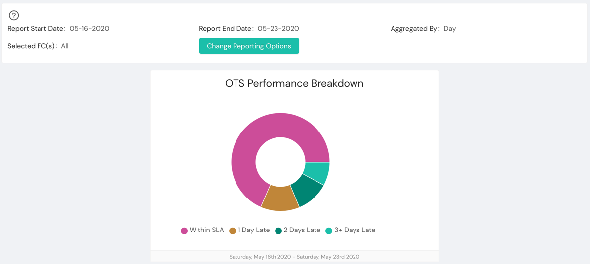
Much of the data in a fulfillment or business context can be usefully represented as a percentage of some total set. A common example is to analyze what percentage of a data set falls into which grouping of data. A wheel chart lets you easily look at this data and understand the differences in relative distribution of values.

In a Shipium wheel chart, you can hover over any of the segments to get a summary of the data in a text form as well.
In the example above, you can see a wheel chart showing the distribution of order-to-ship times. By quickly scanning, you can see that the majority of order-to-ship is "Within SLA" with "1 Day Late" and "2 Days Late" coming close behind at nearly equal percentages.
Line graph report panel
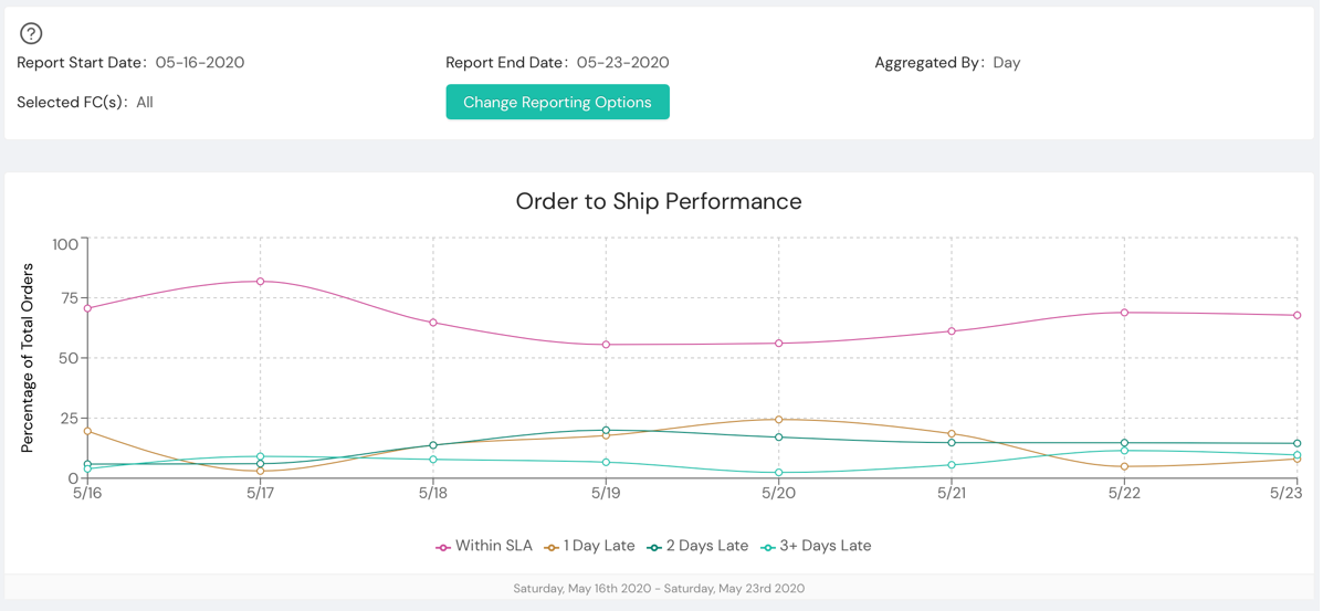
A line graph is makes it easy and quick to look at multiple data sets at once, generally over time. This is a go-to if you are trying to understand how data has changed over some time period and if there are any rising or falling trends.

For example, a line graph of order-to-deliver times that is falling over a long time period makes clear the improvement that your company is making in that metric. Likewise, a sudden spike can be an indicator that a specific week needs to be investigated.
In a Shipium line chart, you can hover over any of the points to get a summary of the data in a text form for all of the data sets at that point. This is particularly helpful when there is a tight grouping of points around a close set of values.
In the example above, you can quickly compare the trends in the distribution of orders across different categories of order-to-ship performance. For instance, you can see that from 5/17 to 5/19 that there is a drop in shipments that hit SLA (in the magenta line) ,which is matched by increases in "1 Day Late" and "2 Days Late" over that same period. Something occurred during that time period that caused a 1- to 2-day delay in almost 25% of shipments.
Resources
Your Shipium team member is available to help along the way. However, you might find these resources helpful:
Updated 4 months ago
