The Orca AI Agent is meant to be relatively intuitive, but as with any system real-world examples help you get an idea of how you might want to interact with the system. These examples are by no means exhaustive, but they are intended to give you ideas for how to complete common tasks using Orca.
What should an Orca AI Agent question look like?
There are a few major components to any good Orca AI Agent question (and some optional ones, depending on the chart type). They are listed below in the order in which they frequently appear in questions.
Question component
Description
Example
Metric visualization
How do you want the answer to the question you are asking visualized?
Common visualizations include:
Pie chart
Bar chart
Columnar (or column) chart
Stacked columnar chart
Line chart
Table (if you want to look at the data or download it for excel)
Pie chart
Data to be used
What data are we operating on? Usually this is probably shipments or delivery promise views or something similar.
shipments
Data breakdown
For a distribution visualization like a pie chart, how do you want the data split out? By carrier? By destination state? By origin country?
broken down by carrier
Filters
What is the time period that this should be over? Should it only include certain carrier values or origin postal codes or something else?
for the last week
Here's what the request looks like together:
I would like a {visualization type} of {data to be used} broken down by {data breakdown} for {filters}
For example:
I would like a line chart of shipments broken down by carrier for the past 2 weeks
⚠️
Verify that the correct data set is selected for your query
This can be selected just above where you enter a question or request a visualization.
Having the wrong data set can prevent you from getting an appropriate response back.
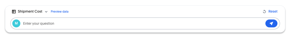
Sample Orca AI Agent question entry
Sample Orca AI Agent questions and responses
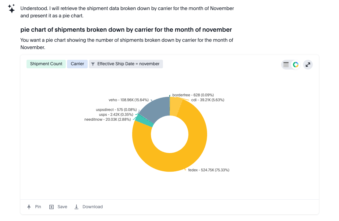
Example 1. Shipment count distribution request as a pie chart
In this example, we want to understand the distribution of shipment counts by carrier, or what percentage of shipments were shipped with which carrier. In addition, we want to only look at shipments that had an effective ship date during the month of November.
Query
For this kind of query, a good general rule of thumb is to include the following in your prompt:
The metric visualization you want (pie chart, in this case)
The data for which you want the calculation done (shipments, in this case)
How you want the data broken down (by carrier, in this case)
Any filters (the month of November, in this case)
I would like a pie chart of shipments broken down by carrier for the month of November
Results
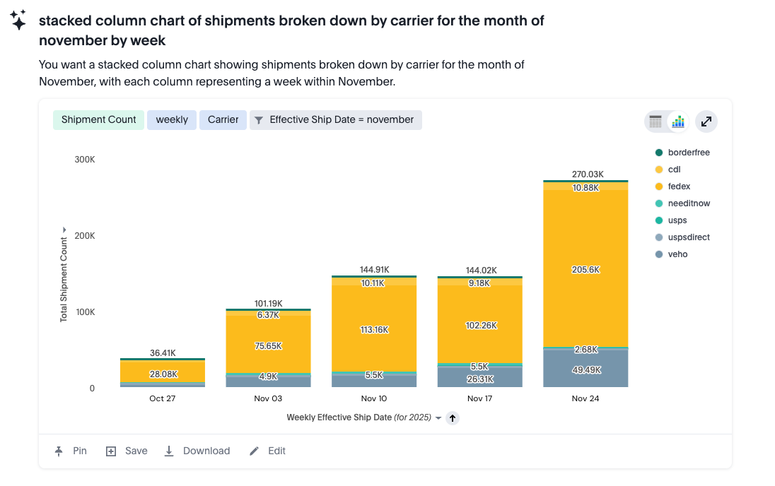
Example 2. Shipment count distribution request as a stacked column chart
Looking at Example 1, if we want to go from a pie chart to a stacked column chart, we need to change two inputs:
Change the visualization from "pie chart" to "stacked column chart".
Add information about how big we want each column to be during the time period. Here we specify "by week", but you could also do "by day". If you were looking at only a day's worth of data, you might use "by hour".
Query
Using our framework above, here's what we are doing:
The metric visualization you want (stacked column chart)
The data you want the calculation done on (shipments).
How you want the data broken down (by carrier)
Any filters (the month of November)
Another data breakdown (by week)
I would like a stacked column chart of shipments broken down by carrier for the month of November by week
Results
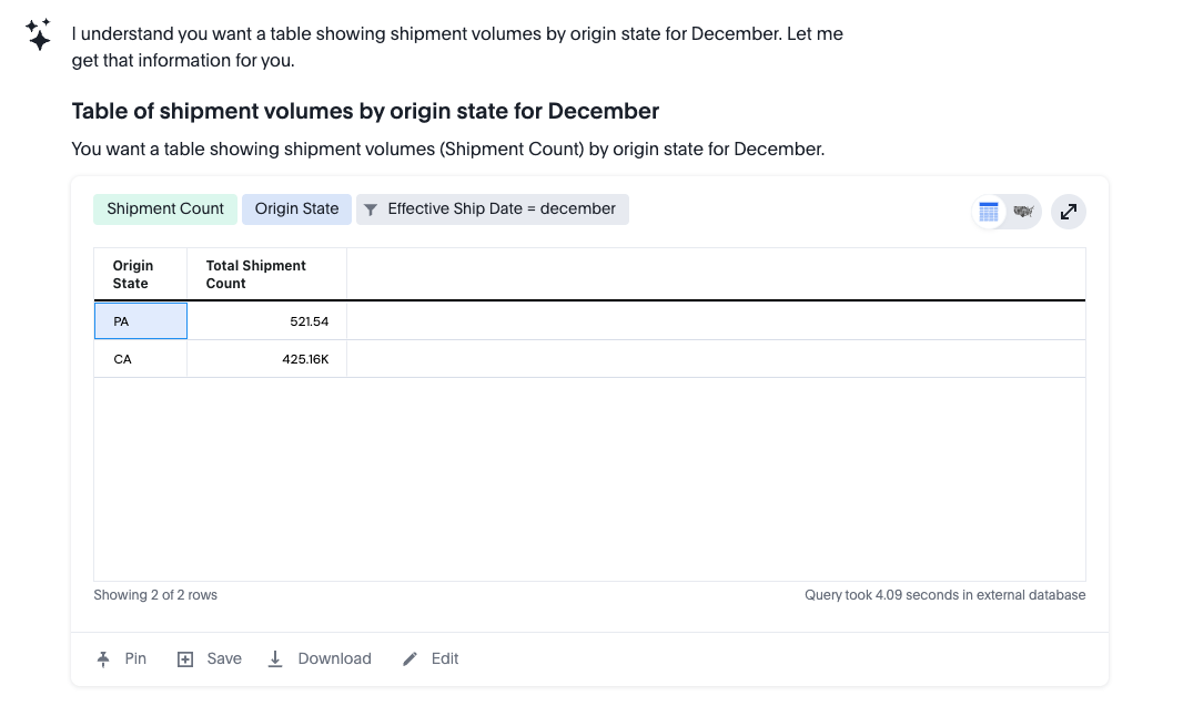
Example 3. Shipment volumes by origin state request as a table
In this example, we want to understand the distribution of shipment counts by their origin of shipping, or how many shipments were shipped from each state in which there are warehouses. In addition, we only want to look at shipments that had an effective ship date during the month of December. In this case, we are going to request the data as a table.
Query
I would like a table of shipment volumes by origin state for December
Results
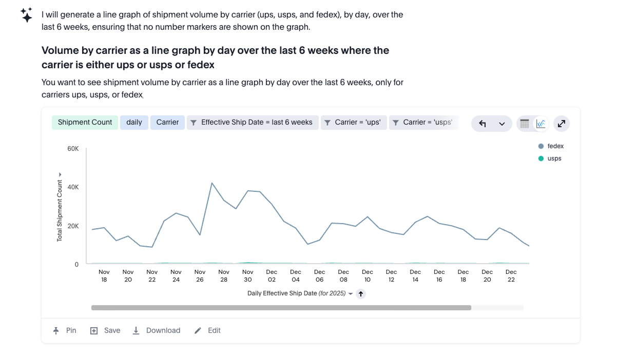
Example 4. Volume for specific carriers by day request as a line graph
In this example, we want to see the volume of shipments for a particular set of carriers (UPS, FedEx, and USPS) represented as a line graph at the daily level. In addition, we only want to look at shipments that had an effective ship date during the month of December.
Query
I would like to see volume by carrier as a line graph by day over the last 6 weeks where the carrier is either ups or usps or fedex
Results
This example is helpful in terms of understanding how easy it is to restrict the data being shown in the Orca interface to only certain information. In this case, we have limited it to only a certain time range and only a specific list of carriers, but any data field available could be used when filtering, such as origin state, destination state, carrier method, and many others.